Leptos Components
Beautiful Rust UI components for Leptos applications. Copy-and-paste components to quickly build modern fullstack web apps.
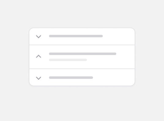
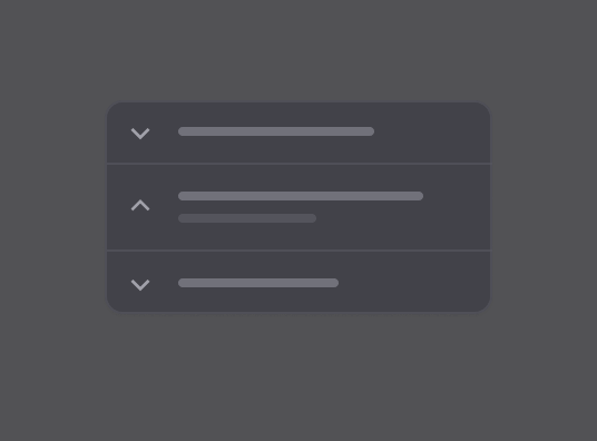
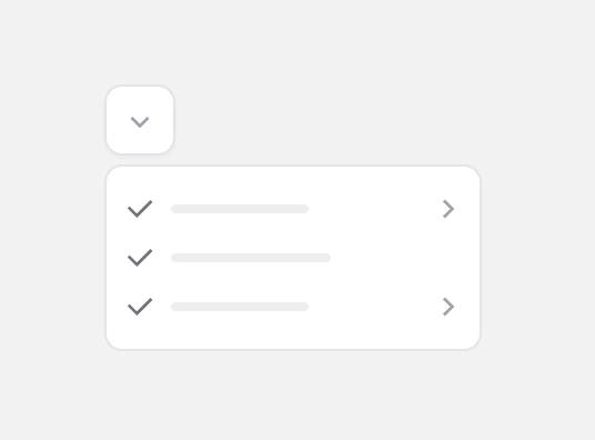
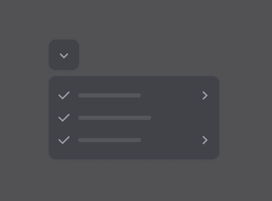
Accordion
Rust/UI component that displays an Accordion.
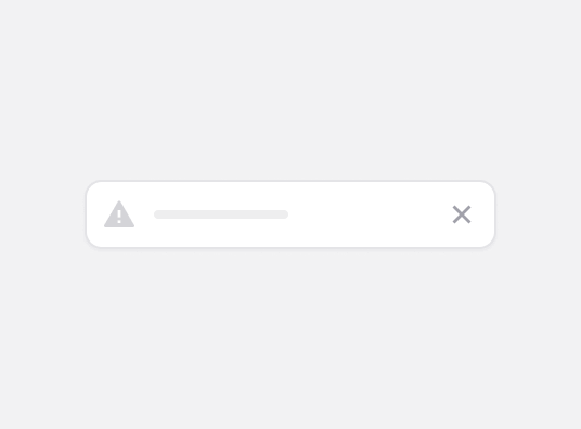
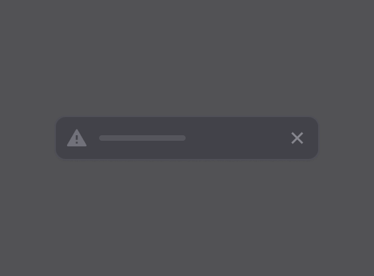
Alert
Rust/UI component that displays a callout to the user.
Alert Dialog
Rust/UI component that displays a modal dialog that interrupts the user with important content and expects a response.
Animate
A wrapper for animations, made with Tailwind CSS. Works seamlessly with any children component.
Animate Group
A wrapper for animations, made with Tailwind CSS. Works seamlessly with any children component.
Avatar
Rust/UI component that displays an avatar with image and fallback support.
Badge
Rust/UI component that displays a badge or a component that looks like a badge.
Bottom Nav
Rust/UI component that displays a mobile-friendly bottom navigation bar.
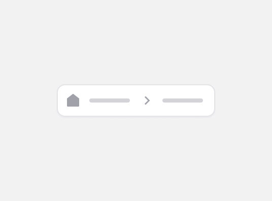
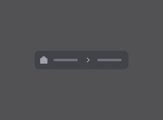
Breadcrumb
Rust/UI component that displays the path to the current resource using a hierarchy of links.
Button
Rust/UI component that displays a button or a component that looks like a button.
Button Action
A button that requires press-and-hold to activate, showing a progress indicator.
Button Group
A component that groups multiple buttons together with shared borders and styling.
Card
Rust/UI component that displays a card with header, content and footer.
Card Carousel
Rust/UI component that displays a card similar as Airbnb Card.
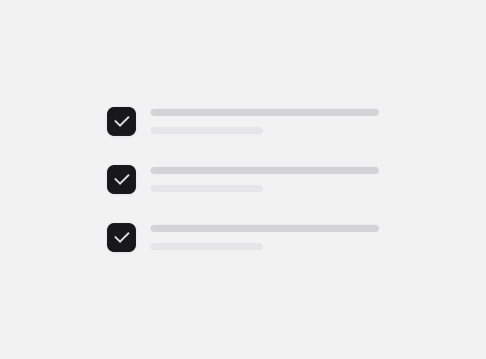
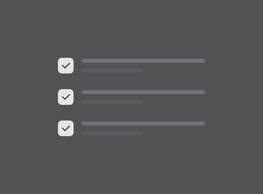
Checkbox
Rust/UI component that displays a control that allows the user to toggle between checked and not checked.
Chips
Rust/UI component that displays a chip or a component that looks like a chip.
Combobox
Autocomplete input and command palette with a list of suggestions.
Command
Fast, composable, unstyled command menu for Leptos.
Context Menu
Rust/UI component that displays a context menu on right-click.
Data Table
Powerful data table with advanced features including filtering, sorting, column visibility, and row selection.
Date Picker
Rust/UI component that displays a date picker.
Dialog
Rust/UI component that displays a modal dialog that the user can interact with.
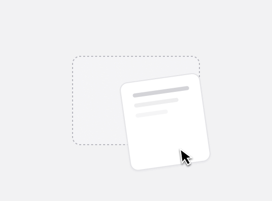
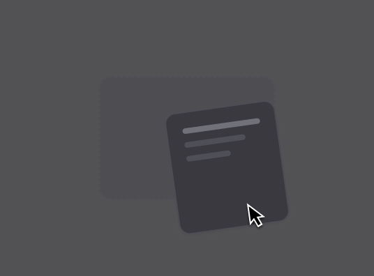
Drag and Drop
Rust/UI component that allows users to drag and drop elements.
Drawer
A Drawer for Rust. Inspired by the amazing work of Emil Kowalski.
Dropdown Menu
Rust/UI component that displays a dropdown menu.
Dropzone
Rust/UI component that allows you to drop files onto it.
Empty
Use the Empty component to display a empty state.
Form
Rust/UI components for building accessible forms with labels, descriptions, and error messages.
Input
Rust/UI component that displays an input field that allows the user to enter text.
Input Group
A component that combines inputs with addons like icons, text, or buttons.
Input OTP
Rust/UI component that displays an OTP input.
Input Phone
Rust/UI component that displays a phone number input with country code selector and automatic formatting.
Item
A flexible container component for displaying list items with media, content, and actions.
Kbd
Display keyboard shortcuts and key combinations with proper styling.
Label
Rust/UI component that displays a label for an input field.
Marquee
Rust/UI component that displays an infinite scrolling component that can be used to display text, images, or videos.
MultiSelect
Rust/UI component that displays a dropdown menu that allows the user to select several options.
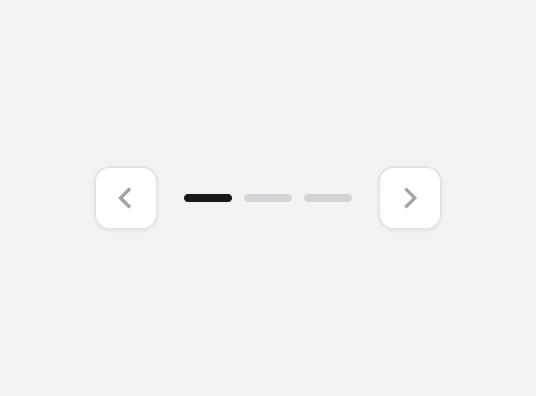
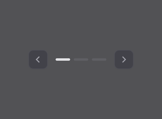
Pagination
Rust/UI component that displays a pagination component.
Popover
Rust/UI component that displays rich content in a portal, triggered by a button.
Pressable
Wrapper component that adds press feedback (scale effect) to any children.


Radio Button
Rust/UI component that displays a set of checkable buttons where only one can be selected at a time.
Radio Button Group
Rust/UI component that displays a group of radio buttons.
Scroll Area
Rust/UI component that provides custom scrolling functionality with cross-browser styling.
Select
Rust/UI component that displays a dropdown menu that allows the user to select an option.
Separator
Rust/UI component that displays a separator line.
Sheet
Rust/UI component that displays a sheet.
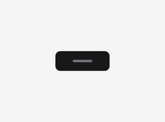
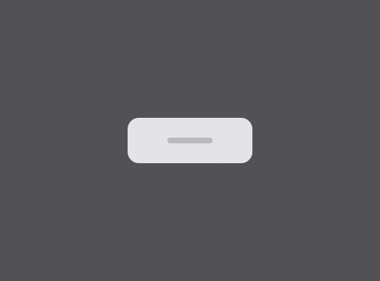
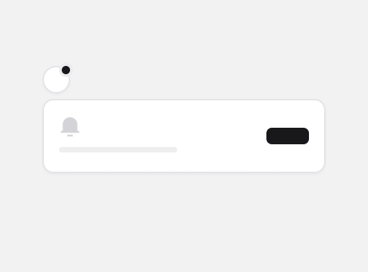
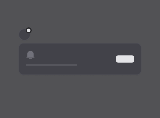
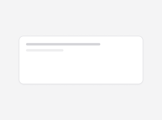
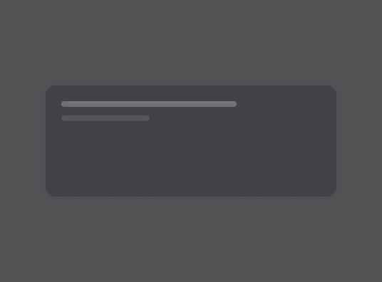
Skeleton
Rust/UI component that show a placeholder while content is loading.
Slider
Rust/UI component that allows users to select a value from a range.
Sonner
Rust/UI Toast, inspired by Sonner.
Spinner
A loading spinner component with animation for indicating processing states.
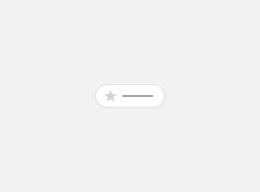
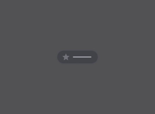
Status
Rust/UI component for displaying statuses.
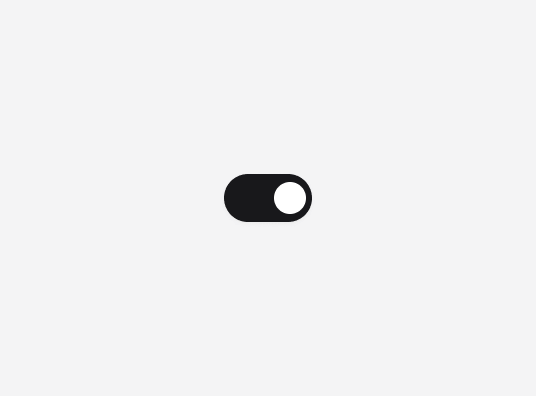
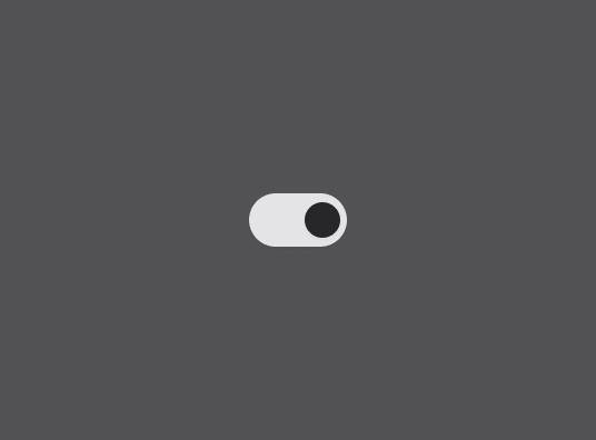
Switch
Rust/UI component that displays a control that allows the user to toggle between checked and not checked.
Table
Rust/UI component that displays a table with header, body and footer.
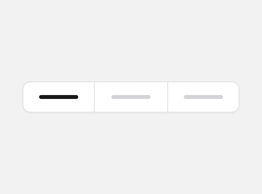
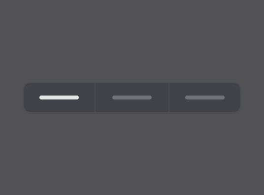
Tabs
Rust/UI component that displays a set of layered sections of content, known as tab pages, that are displayed one at a time.
Textarea
Rust/UI component that displays a textarea.
Theme Toggle
A sleek theme toggle component that smoothly transitions between light and dark modes with animated sun and moon icons.
Toast
Rust/UI component that displays toast notifications.
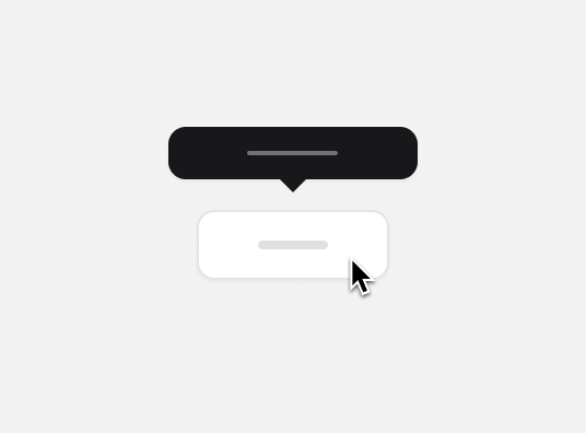
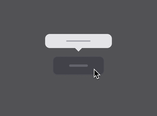
Tooltip
A popup component that displays informative text when users hover over, focus on, or click an element.